- No Obligations
- Stop Paying Too Much For Your Contractor
- No Spam Calling
- Screened & ID Checked Contractors only!
Complementary Colors to Use when Painting Accent walls
1
 Complementary Colors to Use when Painting Accent walls
earlyexperts.net
Complementary Colors to Use when Painting Accent walls
earlyexperts.net
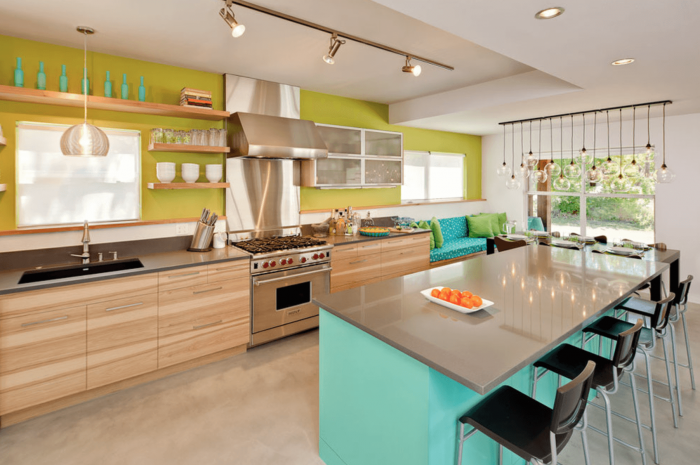
Accent walls are not there just because you run out of paint when remodeling a room. An accented wall color can become a focal point of a room at the same time creating a new look for minimal effort and at a low cost. Color accented walls can add architectural appeal to a boxy room, and draw the eye to any focal point such as a fireplace.
What is often the most difficult problem is to choose the right color to accent the wall in a room. Getting the right color should compliment the other colors in the room and the architecture of the space itself.
What are Complementary Colors
Designers, artists, and stylists use a color wheel to understand the relationship between different colors of the spectrum. The colors are arranged in a circular wheel as they pass through the spectrum, and those on opposite sides of the wheel are described as complimentary. Colors that are seen as complimentary can when seen side by side make each appear brighter. When mixed complementary colors create a neutral hue.
The way the color wheel is arranged, means that the opposite of a primary color will be a secondary color made from mixing two other primary colors. For instance, for the primary color blue, the complementary is orange, which is a mixture of yellow and red.
The color wheel can be split into primary, secondary, and tertiary colors, giving an infinite variety of hues. However, one thing never changes, and that is hues on opposite sides of the color wheel are always complementary.
Complementary colors also have different ‘temperatures’, with one cool and the other warm. From our earlier example, blue is cool, and the orange warm. This is what is known as simultaneous contrast, and the most noticeable contrasts on the color wheel. When you have this simultaneous contrast, the two colors side by side will make the other stand out and grab the attention of a viewer. That’s why artists like to paint sunsets with color gradients from deep blue to bright orange, as they catch the eye more due to the phenomena of simultaneous contrast.
Choosing the Right Wall
If you want your accent wall to stand out, there are a few guidelines to follow to make sure it does the business.
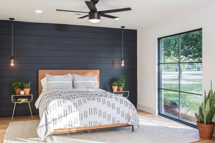
Pick a solid wall with no doors or windows. That doesn’t mean you shouldn’t accent a wall with an architectural feature but is is more to do with light and shade. If you decide to accent a wall with a window or French doors, then you will lose all the drama of the different color as any light coming through the window will make the surround look much darker. The same can be said of other openings such as doors.
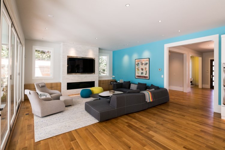
Pick a short side. If your room has an oblong shape, then it is best not to accent the longest wall, as this will only make the room look longer and more like a corridor. Try and add the accent color to the short wall farthest from the entrance of the room. By drawing attention to the wall most distant way, it will give the impression the room is more compact, and that wall is closer to you. In an open plan living, walls shared by two separate living areas can also be a problem when accented. The color destroys the visual definition of the spaces and can make spaces unbalanced and disproportionate.
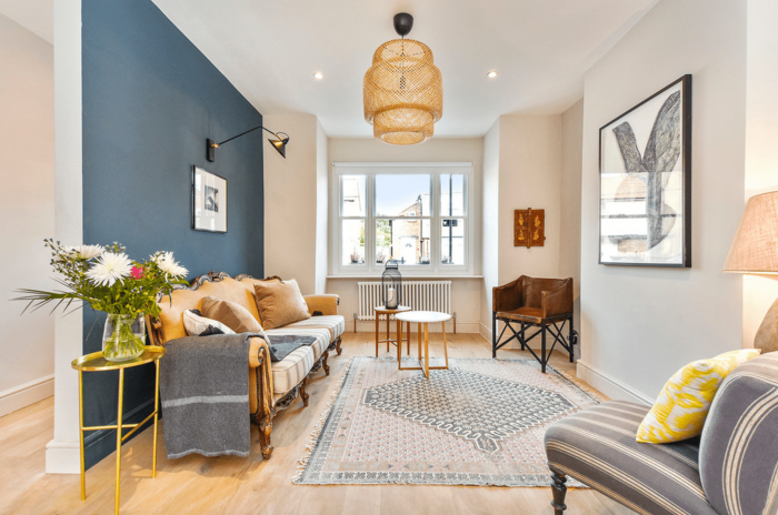
Pick out a highlight. If the room already has a focal point, such as a fireplace, try not to hide it, but use it as the basis of your accent wall. You are never going to hide an architectural feature as they were designed as such within your home. It’s better to work with it, rather than compete against it and try and create a second focal point.
Consider painting the wall on which the fireplace stands a complementary color, or even include the fireplace and paint that as well blending both into your accent wall. Other highlights in a room include niches, which can be painted a complimentary color to make them stand out and draw the eye.
Create a focal point. If the room has no obvious focal point for the eye, your chosen accent wall can become a showcase for some favorite artwork, photos, or as a background for a piece of furniture. By using the accent wall as a backdrop, it will give the item you want to highlight more attention.
Avoid confusion. What else is going on in the room? If you have a dramatic piece of artwork, or an elegant mirror hanging on a wall, an accent wall next to it will just create confusion for the eye. Adding an accent color may overwhelm the room if you are not careful.
Choosing the Right Color
Getting the right color for the accent wall makes all the difference.
The Classic Look: Modern new homes come with what is known as a builder’s finish, which basically means the walls are all painted white. Therefore any accent color you choose will have the classic look of being a darker color against the lighter main body of the room. In years gone by the color applied to walls was often darker, so an accent color would have to be a lighter.
This is much trickier to get right, and if you don’t have much experience in color coordination is best left to expert interior designers. For a foolproof method of getting a darker accent wall that works, simply paint the wall a couple of shades darker than the predominant color of the room.
Match the Décor: The worst thing you can do is use an accent color that clashes with the décor in the room. To ensure this doesn’t happen try and pick out a color that is already present.
However, don’t go for the color of your curtains or upholstery, as this will prove to be too much, and totally overpower the room. Look at colors in such things as throw cushions for inspiration.
Color as a Showcase: As we mentioned earlier, the accent wall should be a showcase and focal point for the room. If you are going to use the accent wall to hang pictures on, or as a backdrop for a piece of furniture, ensure the color you choose coordinates.
You don’t want a clash of colors, and neither do you want the artwork or furniture to disappear into the background.
The Color Palette
How the different colors match, contrast and compliment can give a room a varied feel. Getting the right color pair right can be an art as much as a science. When the main color is either a primary or secondary color, there are some simple complimentary choices for an accent. Here are some examples of how to work with accent colors.
Primary Colors
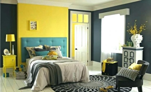
Yellow with blue accent. Yellow is a naturally warm color and is also light and bright. The classic complimentary accent color is a cool blue. Even if you pick a more muted yellow tone such as mustard, and less vibrant blue, a visual balance will be created between the two which will keep the space from getting too hot.
Yellow with purple accent. In keeping with opposites of the color wheel, yellow and a purple accent gives a dramatic high-fashion look. A more muted yellow will be enhanced by the vividness of the purple.
Blue with yellow accent. As yellow and blue are complimentary primary colors, they can be easily switched as accents. Cool blue walls can be set off with a complimentary yellow without needing to mute the colors, so they overload the room.
Blue with blue accent. In a contradiction to the opposite color wheel complimentary accent rule, blue is a color that can be accented by itself. It is a color that can create a monochromatic scheme which compliments itself because of the tonal mixture rather than contrast.
Red with white accent. Whereas blue is easy to accent and compliment, red is much harder. It has associations with love and romance that make it very difficult to compliment. Often, interior designers when faced with red match it up with white as it avoids a clash of colors and softens the look.
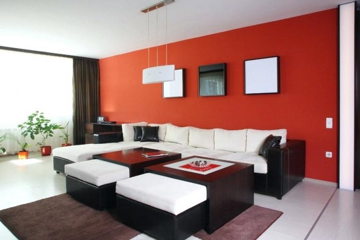
When red is applied to a feature wall as an accent, it can easily take over the space and becomes so dominant that it can overpower a room, so its use should be considered carefully.
Red with blue accent. Surprisingly for some, there is one color that accents red well, and that is blue. If you look at the color wheel, the actual compliment for red on the spectrum is green, but blue can take its place easily, and provide a less dramatic impact on a room. Red and blue are the colors we associate with national flags, so the mix is something we are used to and sometimes take for granted.
Secondary Colors
Orange with green accent. Orange may be the new black, but as a combination of red and yellow it really stands out, and that makes it difficult to accent. The direct complement of orange happens to be blue, but that an be too cool, so a leaf green makes a better match. Just think of looking at a beautiful orange tree.
Purple with purple accent. Just think of a field of lavender, and how the variations in the purple color can be both warm and calming. Dark purple is the color of royalty, and using that as an accent of a much lighter tone such as pale lilac can be both regal and romantic.
Purple with yellow accent. If you are looking something with a little whimsy while still staying grounded, earthy yellow tones work well with soft purple and lavender.
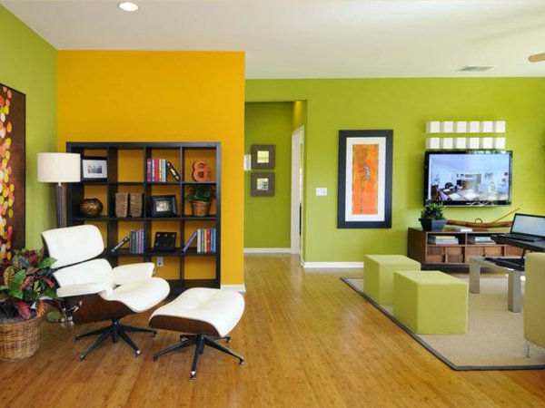
Green with red, yellow, and orange accent. This takes a much broader view of complimentary colors on the color wheel. Rather than the direct opposite, this contrasting accent takes the range from red to orange.
Green with blue, violet, and purple accent. Green is the anchoring color in the room, onto which you can project accents of blue through violet. The room will be full of vibrant color and have an exotic and dramatic feel.
Pink with green accent. Pink is just a lighter shade of red, so it sits well as a compliment to green as an accent. The combination has an air of sophistication that comes from the fact the two hues are direct opposites.
The Fail-safes
Not everyone wants to paint a room in two colors. Most people stick to white, or and off-white color for walls as they provide a bright, clean, modern feel to a room. However, that does not stop one from having an accented wall. The great thing about having a room with white walls, any color can work as an accent. As we have suggested before, it’s best to look for a color which is not already present in curtains or upholstery for an accent hue.
Look for it in soft furnishings or artwork. Nowadays, fashion has turned to accept gray as a color for walls that is both neutral and calming. Picking a natural color such as metallic or green can add depth to the scheme of a room.
Most Read


The Right Time to Fertilize Your Lawn
Apr 06, 2021
She Sheds Ideas for Every Budget
Aug 29, 2018

10 Home Checks to Make Before a Vacation
Apr 06, 2021