- No Obligations
- Stop Paying Too Much For Your Contractor
- No Spam Calling
- Screened & ID Checked Contractors only!
Unusual Exterior Color Palettes That Work Really Well
2
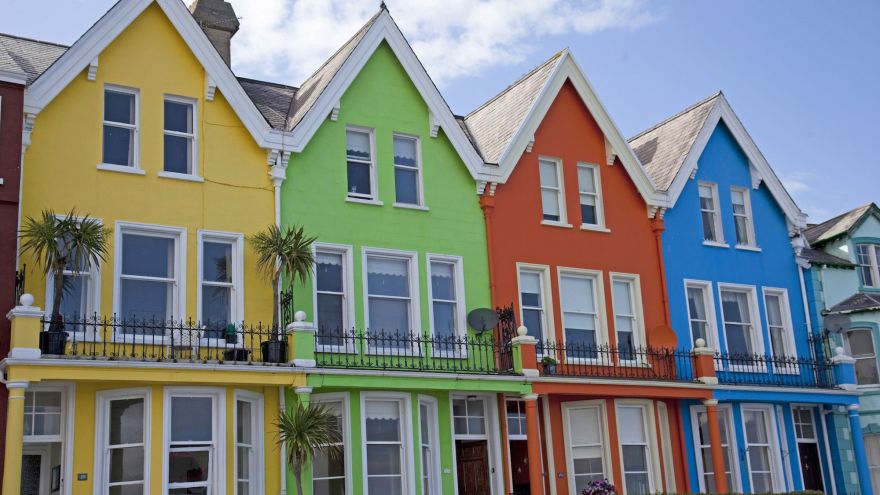 Unusual Exterior Color Palettes That Work Really Well
earlyexperts.net
Purchasing a home is an incredibly exciting time. Finally getting the keys to your new place and opening the door for the first time is always the start to a new adventure. While there are certain to be both highs and lows (I bet you didn’t think you’d have to replace that appliance as soon as you did!) overall the journey of home ownership is a positive one.
Once all the paperwork is complete and the house is yours, the fun part can begin. That’s right- decorating! Decorating your new house is what turns your house into a home. While you may enjoy some of what you inherited from the previous owners, more than likely there are going to be some changes you want to make.
A lot of attention is given to interior design and decorating, and with good reason. Your home is your sanctuary, and you want it to look perfect. But – what about the outside of your house? Your exterior is the first impression your house makes to the world, don’t you want it to be a good one? Of course you do!
You might think you don’t have a lot of options when it comes to your exterior, but that couldn’t be further from the truth! Just as you make decisions about wall color inside the house, you can do the same outside. Now, keep in mind if you live in a neighborhood with a homeowner association (or HOA), you may need to get approval for any changes you make to your exterior.
With that in mind, let’s discuss five unique exterior color palettes that work really well.
Cool Shades: White, Gray, Turquoise
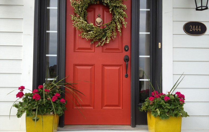
Depending on where you live, you might be very used to seeing red or orange brick houses with black or brown doors. There’s nothing wrong with that! But a cool color palette can really switch up the appearance of a home. White or off-white brick is very popular these days. Start with that as your main color and then have a little fun when it comes to accents such as any shutters you might have and most importantly, your front door!
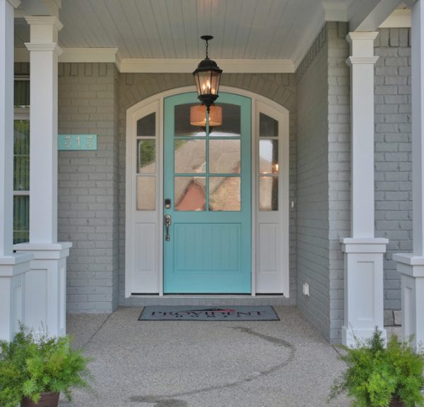
A popular choice? White brick, light gray shutters, and a turquoise door. All cool tones, with a bold pop of color at the front door. This is a big change to make if you are coming from dark brick, but isn’t too bold. There is a nice softness to the look of a house with these colors, it is very inviting. You can always go with a more muted turquoise if you don’t want to make that much of a statement.
Modern Impact: Yellow and Gray
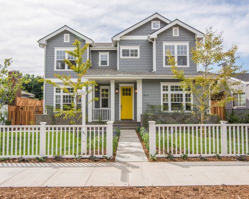
Let’s kick it up a notch. If you have more freedom with your color choices, and if you live in a more modern style home, you can really have some fun when it comes to your color palette. If you see the word yellow and start to panic, don’t! Yellow tends to scare a lot of people, as it can be a really bold choice and hard to pull off in just about any design sense. Stick with us, though! A nice pleasant shade of yellow with a medium shade gray (not too light, not too dark) is a really modern look that isn’t too bold. Make the majority of the house gray, and find some accent areas to use the yellow.
Timeless Beauty: Sage Green, Light Brown, and White
Are you looking for something unique, but don’t want to go too far outside the box? That is totally understandable. Selecting a nice sage or olive tone green and contrasting it with a light brown is a beautiful look that you don’t see often. The light brown may be wood accents you have at your house (perhaps pillars or your front door). Wood can be used in a wonderful way as an accent at your home without looking like you are living in a log cabin. Add in white to give some contrast and to make the colors pop.
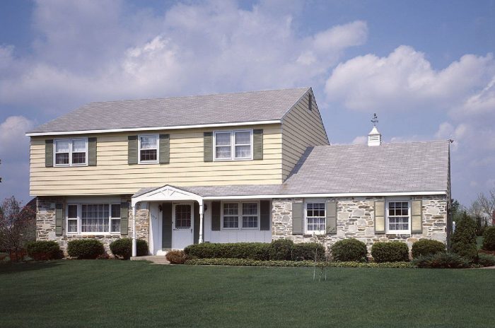
Green and brown can be seen as very traditional, but by picking more modern, muted shades you are taking your house in a modern direction without having to select any bold, bright colors. If you live in a neighborhood with traditional looking homes, this is a great way to stand out without going over the top (and annoying your neighbors).
Bold: Lime Green, Dark Gray, and White
Back to bold! Sometimes you just need to have some fun and select a really wild, fun color. In this case, we went with lime green. What makes the lime green okay is that it is combined with a dark gray and white. Gray has become the go to color the past several years in the design world- gray is the new neutral shade that everyone loves. Selecting a dark gray and combining it with white gives some nice contrast. Paint your brick, stucco, or siding the dark gray for example, and paint your trim or shutters white. All that’s left is to go bold with the front door. Lime green is a great, fun pop of color that you could also extend to your mailbox as well if you really want to go for it.
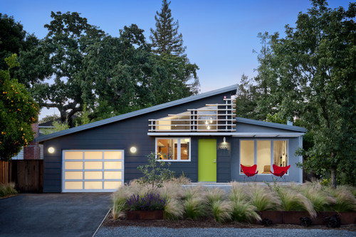
If lime green isn’t your color, feel free to pick another bold shade. Perhaps a tangerine green? Highlighter yellow? Neon bright shades, believe it or not, work incredibly well with the dark gray and are a really fun way to add color to your exterior. By keeping it contained to one or two areas you can easily pull it off.
Tuscan Inspired: Golden Yellow, Brown and White
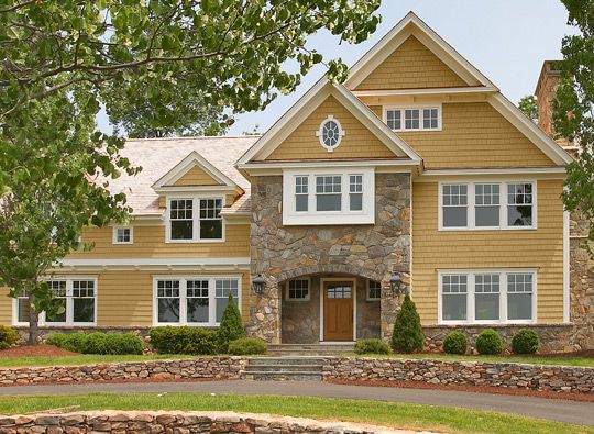
Finally, if you have a more Spanish style house, you might want to go with a more Tuscan, traditional inspired look. You can still have some fun, though! Most houses in this style are painted a nice cream or off white shade. To stand out, go with a warm golden yellow shade as your main color. Add in some white accents to break up the yellow and introduce some brown either with the shutters or on the roof. This is a really warm, traditional look that goes perfectly with stucco and Spanish style homes.


